


Clear, specific instructions are the difference between a usable visualization and an AI fever dream.
Whether you’re a sales analyst trying to spot Q2 2026 trends or a marketer defending a budget allocation, data visualization is one of the most powerful communication tools available. However, actually building those charts has always required either technical skill or expensive software. AI is changing that, but only if you know how to ask.
The dirty secret of AI charting is that most outputs are, by default, unusable. Missing axis labels, floating legends, and incoherent color choices. The AI isn’t broken, the prompts are. Once you understand the difference between a vague instruction and a structured one, the results shift dramatically.
What follows are eight prompts covering the most common real-world use cases, from finance to fitness, from real estate to social media, designed to work across any major AI tool: ChatGPT, Claude, Gemini, Qwen, Grok, or Meta AI.
- Why vague prompts fail
- Sales growth over time data visualization (Line chart)
- Budget allocation breakdown (Pie/Donut)
- Customer demographics comparison (Grouped bar)
- Website traffic trends (Time series)
- Survey results summary (Bar chart)
- Real estate price comparison (Scatter Plot)
- Health and Nutrition Tracker (Stacked bar)
- Education or performance benchmarking (Horizontal bar)
- Making these prompts better
Why vague prompts fail
The core problem is one of context. When you ask an AI to build a website, there are decades of design conventions to draw from. Charts don’t work that way. A line chart, for instance, could mean stock prices, temperature readings, or website traffic, each requiring a different data structure, axis scale, and visual approach. Without context, the AI guesses.
The data-layout-style framework
Every effective chart prompt needs three things:
- Data: What information, in what format, over what range?
- Layout: Chart type, axes, dimensions, legend placement.
- Style: Colors, fonts, hover states, and interactivity.
Prompts that include all three produce more consistent, usable results. With that structure in mind, here are eight prompts for common scenarios, each built to work right out of the box.
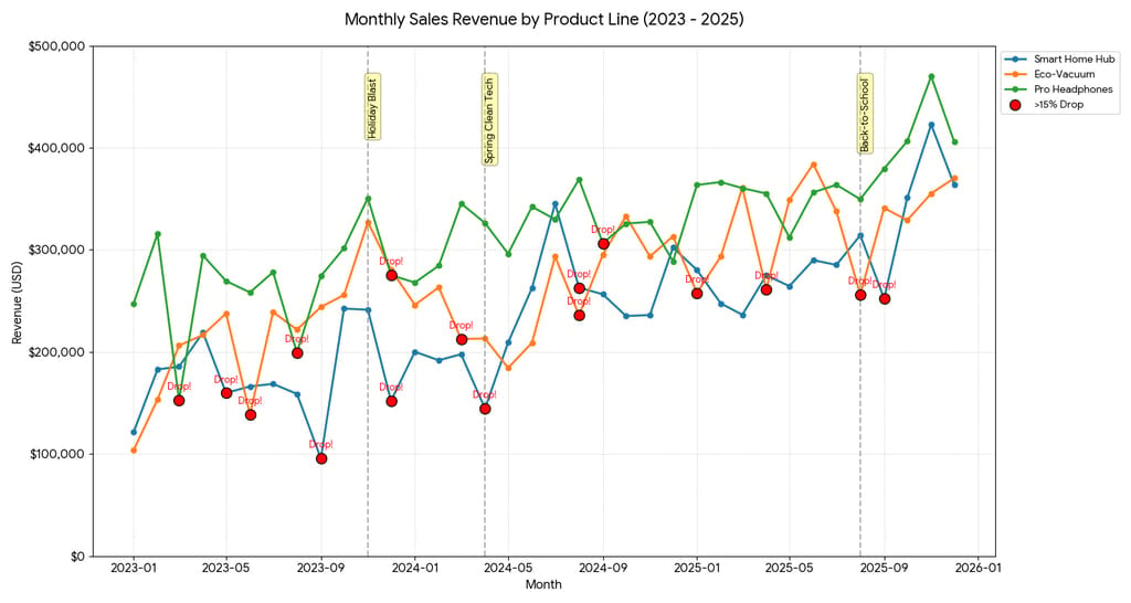
Sales growth over time data visualization (Line chart)
Tracking sales performance over time is one of the most universal needs in any business, and a well-built line chart is the clearest way to do it.
This prompt works because it does more than ask for a line; it specifies a three-year window, names the product lines, sets axis ranges, and requests annotations for campaign periods. That last detail is what separates a useful chart from a decorative one. Without those annotations baked into the prompt, you’ll get the data without the story.
Best for: Sales teams, quarterly reviews, campaign performance analysis. Connecting revenue movements to marketing activity helps stakeholders make planning decisions faster.
The prompt
“Create a line chart showing monthly sales revenue in USD for our top three product lines from January 2022 to December 2024. Display revenue on the Y-axis ($0–$500,000) and months on the X-axis. Use distinct colors per product line and include data point markers. Highlight any month with a revenue drop exceeding 15%, and annotate key marketing campaigns. Format all currency values with dollar signs and comma separators.”
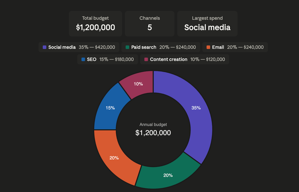
Budget allocation breakdown (Pie/Donut)
Budget conversations are almost always political, and a clear visual removes ambiguity from the room. This prompt is designed for exactly that context, a high-stakes meeting where someone will question why 35% went to social media and only 15% to SEO.
By specifying both percentages and dollar amounts, the chart speaks two languages at once: proportional (for the strategists) and absolute (for the finance team). The donut format is a deliberate choice here over a standard pie chart, because the empty center becomes prime real estate for displaying the total budget figure, a trick that turns a proportion chart into a full financial summary.
Best for: CMOs, finance presentations, and budget review meetings. Donut charts outperform pie charts here because the center hole creates space for a total or headline figure.
The prompt
“Generate a donut chart displaying the percentage breakdown of a $1,200,000 annual marketing budget across five channels: social media (35%), email (20%), SEO (15%), paid search (20%), and content creation (10%). Use a professional color palette, include percentage labels on each slice, and display actual dollar amounts in a legend with USD formatting.”
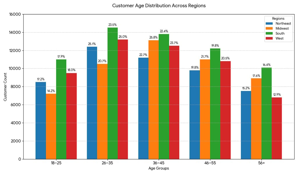
Customer demographics comparison (Grouped bar)
Demographic data becomes genuinely useful only when it can be cut across multiple dimensions simultaneously, age, region, and volume all at once. A single bar chart showing national age distribution misses the point entirely; the interesting question is always where those customers are, not just how old they are. This prompt solves that by specifying a grouped bar structure, which places age brackets side by side for each region rather than stacking them.
Best for: Marketing strategists, product teams. Understanding which demographics dominate which regions shapes channel choices, from TikTok campaigns to print advertising.
The prompt
“Create a grouped bar chart comparing customer age distribution across four regions: Northeast, Midwest, South, and West. Show five age groups (18–25, 26–35, 36–45, 46–55, 56+) on the X-axis, customer counts (0–15,000) on the Y-axis. Use a distinct color per region, include a legend, and add percentage labels above each bar showing that age group’s share of the region’s total.”
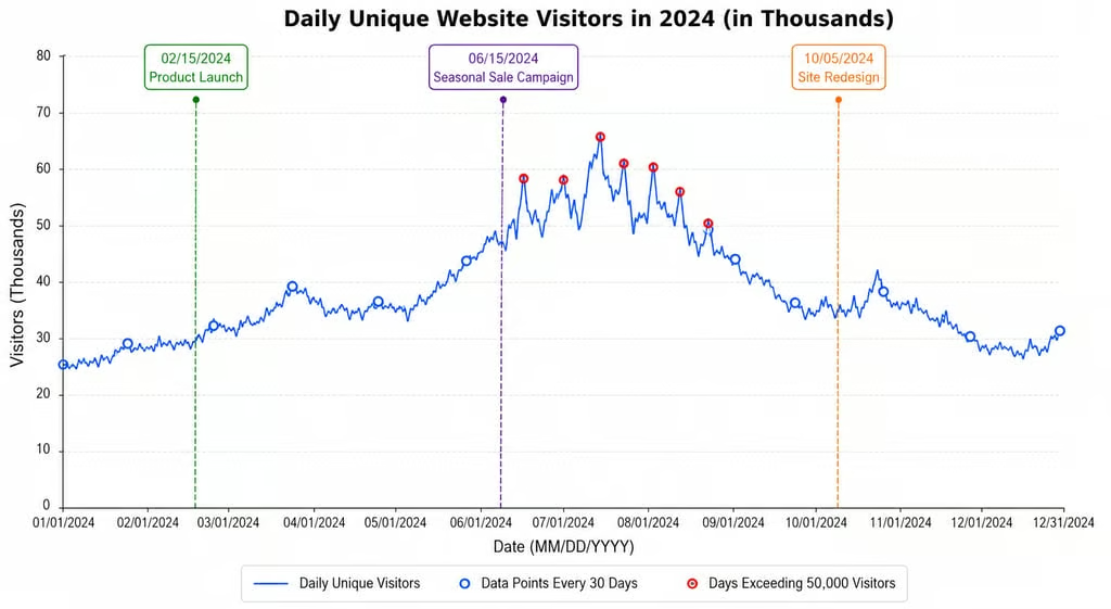
Website traffic trends (Time series)
Web traffic data is one of the most commonly visualized datasets in any digital business, and also one of the most commonly misread. A line that goes up on June 15 means nothing on its own; it only matters in context. This prompt builds that context directly into the chart by requesting vertical annotation lines for a product launch, a sale campaign, and a site redesign.
Best for: Digital teams, growth analysts. Linking traffic spikes to specific events converts a raw count chart into a strategy document.
The prompt
“Produce a time series line chart showing daily unique website visitors from January 1, 2024, to December 31, 2024. Display visitor counts in thousands on the Y-axis and dates (MM/DD/YYYY) on the X-axis. Mark three key events with vertical annotations: a product launch, a seasonal sale campaign, and a site redesign. Add data point markers every 30 days and highlight any days exceeding 50,000 visitors.”
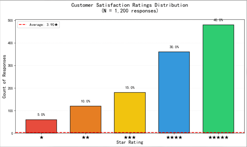
Survey results summary (Bar chart)
Survey data is everywhere in modern business, post-purchase reviews, NPS scores, support ticket ratings and it almost always gets summarized as a single average number that tells you very little. A 3.8 out of 5 sounds acceptable until you realize that 40% of respondents gave a 1 or 2.
This prompt is designed to surface exactly that kind of hidden distribution. By plotting each star rating as a separate bar and overlaying the average as a reference line, the chart makes it immediately clear whether satisfaction clusters around the mean or polarizes at the extremes.
Best for: Customer success, product teams, NPS reporting. The average reference line gives instant context without requiring the reader to do mental arithmetic.
The prompt
“Create a vertical bar chart showing the distribution of customer satisfaction ratings from 1 to 5 stars for our product, based on 1,200 responses. Display count of responses on the Y-axis and star ratings on the X-axis. Add a horizontal reference line marking the average rating (shown as a decimal), and label each bar with its percentage of total responses.”
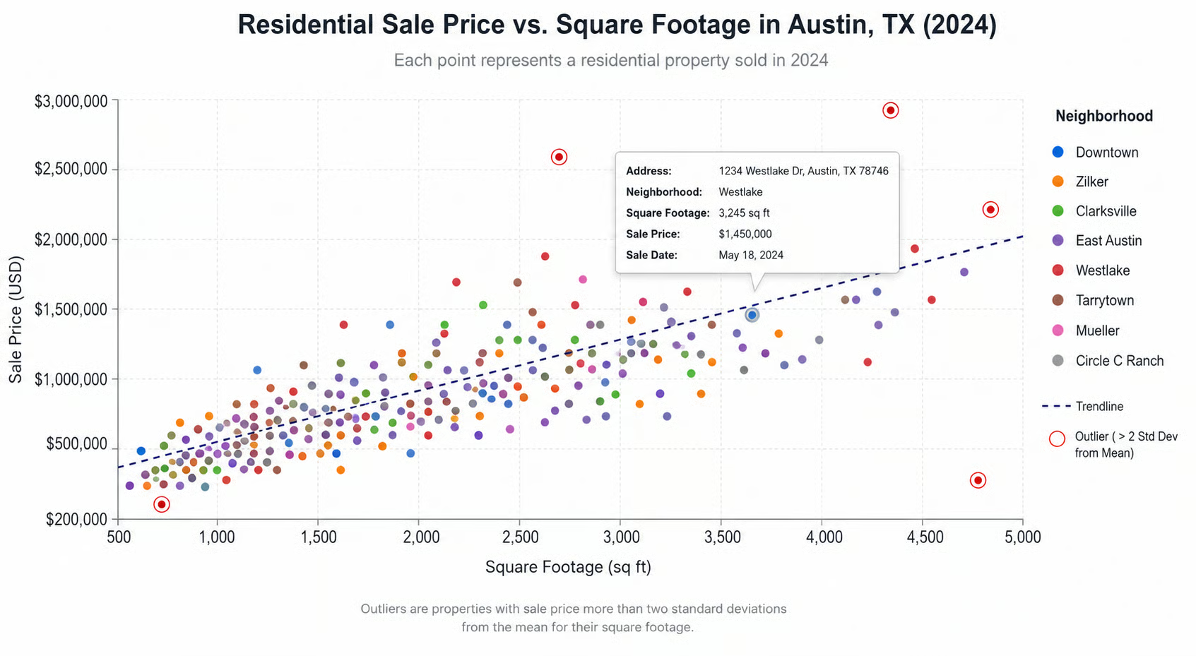
Real estate price comparison (Scatter Plot)
Scatter plots are among the most powerful chart types available, and also among the most poorly executed when generated by AI without guidance. Left to its own devices, an AI will produce a scatter plot with unlabeled axes, uniform dot colors, and no trendline, essentially a cloud of points that communicates nothing. This prompt corrects all of that upfront.
Best for: Real estate agents, property analysts, and urban planners. Outlier highlighting flags either undervalued properties or data anomalies, both worth investigating.
The prompt
“Create a scatter plot comparing square footage (X-axis, 500–5,000 sq ft) against sale price (Y-axis, $200,000–$3,000,000) for residential properties sold in [City] in 2024. Color-code points by neighborhood, add a trendline, and highlight any outliers more than two standard deviations from the mean. Include a legend and tooltip showing address, size, and price on hover.”
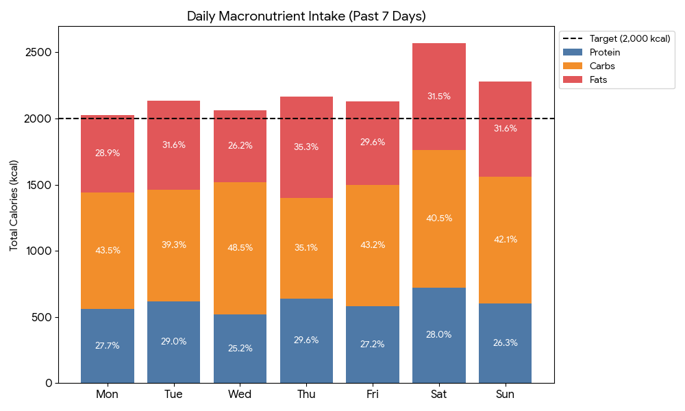
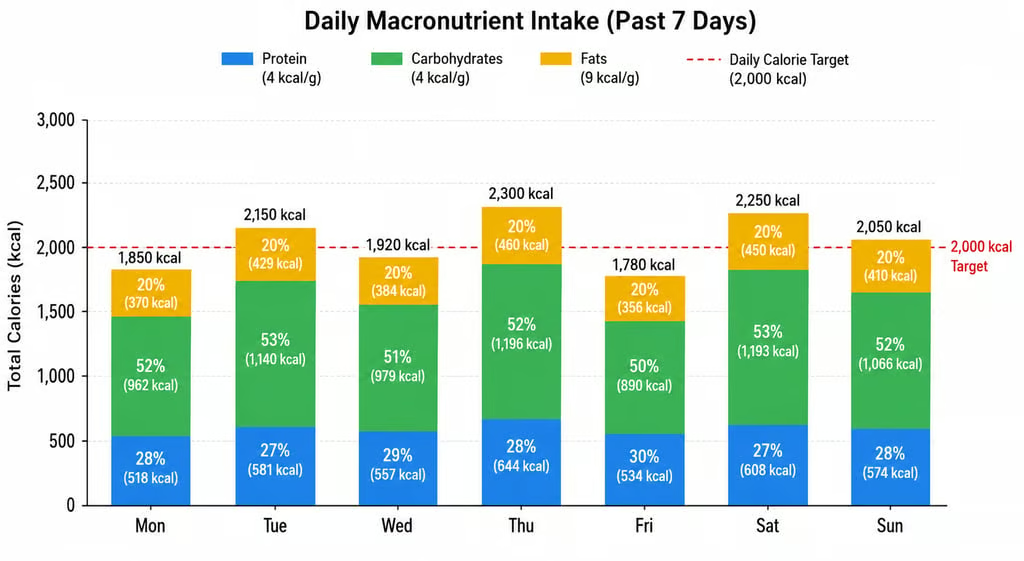
Health and Nutrition Tracker (Stacked bar)
Health and fitness data is intensely personal, which means visualizations in this space need to be both accurate and motivating. A bare calorie count per day is easy to produce but hard to act on; it tells you whether you ate too much, but not why, or in what proportion.
This prompt resolves that by stacking the three macronutrients within each daily bar, so the viewer can see at a glance that Wednesday’s calorie spike was driven by fat intake rather than carbohydrates. The reference line at the daily target (2,000 kcal in this example) creates immediate visual accountability: days that clear the line are instantly visible without any calculation.
Best for: Fitness apps, nutritionists, and personal health tracking. Stacked bars reveal both total intake and macro balance simultaneously, two insights in one view.
The prompt
“Generate a stacked bar chart showing daily macronutrient intake (protein, carbohydrates, fats) for each day of the past week. Display total calories on the Y-axis and days of the week on the X-axis. Color each macro distinctly, add percentage labels within each segment, and include a reference line at the daily calorie target (2,000 kcal).”
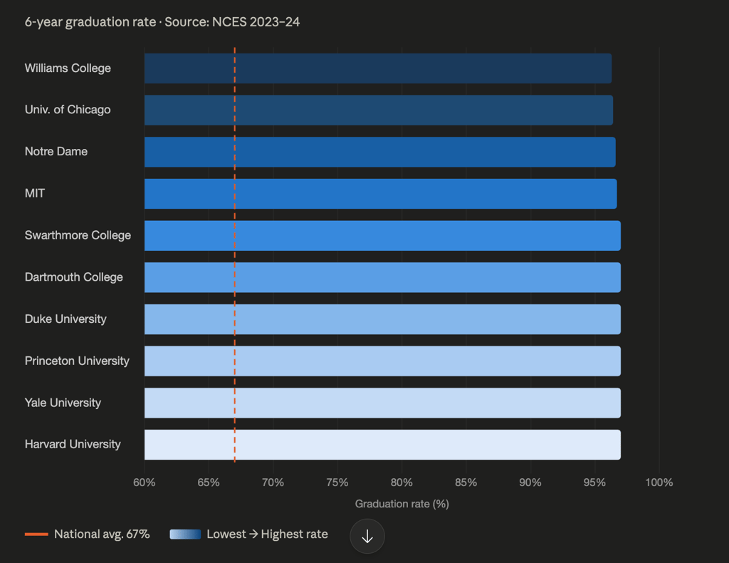
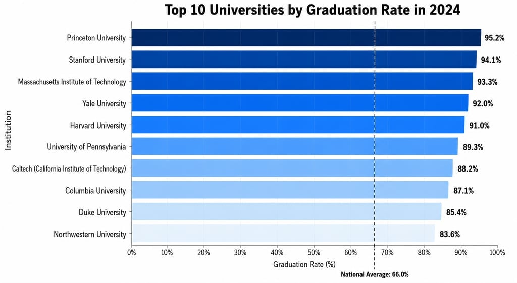
Education or performance benchmarking (Horizontal bar)
Benchmarking and ranking data are staples of education reporting, policy analysis, and competitive intelligence across almost every sector.
The horizontal bar format chosen here is not accidental; it is the correct choice whenever category labels are long enough to cause overlap on a vertical axis, which is almost always the case with institution names, product names, or job titles. The descending sort order makes the ranking immediately legible without requiring the reader to scan back and forth.
Best for: Education researchers, policy briefings, institutional reporting. Horizontal bars handle long institution names far more cleanly than vertical ones.
The prompt
“Create a horizontal bar chart ranking the top 10 universities by graduation rate in 2024. Place institution names on the Y-axis and graduation rate percentage (0–100%) on the X-axis. Sort bars from highest to lowest, add the exact percentage at the end of each bar, and use a gradient color scheme from light (lowest) to dark (highest). Include a vertical reference line at the national average.”
Making these prompts better
Across all of these, a few principles consistently improve output quality.
- Always specify chart type: Don’t let the AI guess. “Line chart,” “grouped bar,” “donut,” be explicit every time.
- Define formatting explicitly: Currency symbols, comma separators, and percentage signs; these will not appear unless you ask for them.
- Name your colors: Hex codes or color names prevent the AI from choosing clashing or confusing palettes.
- Include realistic data ranges: Even if you don’t provide actual data, specifying a value range prevents the AI from generating random or nonsensical scales.
- Break complex prompts into steps: For dashboards with multiple charts, describe each panel separately. Long single prompts often produce incomplete results.
- Ask what type to use first: If unsure, prompt: “What are the pros and cons of a bar chart vs. a line chart for this data?” AI reflects well before it executes.
One additional caution worth flagging: AI chart tools are fast, but they require human review. Identical names with different capitalizations, mismatched color assignments, or stacked values where grouped bars were intended, these errors appear regularly and won’t announce themselves. The output is a starting point, not a finished product.
For more practical AI workflow tips, check out our guide to “vibe coding” and how developers are using AI to build software faster with natural language prompts.