


- Healthcare.gov Debacle: 10 Lessons to Learn About Website Design
- Limit Mandatory Form Fields
- Be Transparent About How You Will Use the Data
- Give Users Choices
- Make Sure to Test, Test and Test Again
- Avoid Lengthy Forms
- Guide by Design
- Consistency Is Key
- Think Through Logic Loops
- Communication Leads to Fewer Errors
- Be Prepared to Scale
Healthcare.gov Debacle: 10 Lessons to Learn About Website Design

by Chris Preimesberger
Limit Mandatory Form Fields
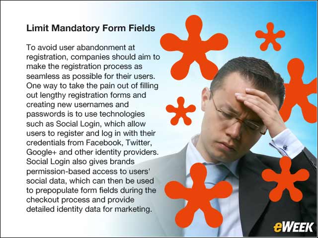
To avoid user abandonment at registration, companies should aim to make the registration process as seamless as possible for their users. One way to take the pain out of filling out lengthy registration forms and creating new usernames and passwords is to use technologies such as Social Login, which allow users to register and log in with their credentials from Facebook, Twitter, Google+ and other identity providers. Social Login also gives brands permission-based access to users’ social data, which can then be used to prepopulate form fields during the checkout process and provide detailed identity data for marketing.
Be Transparent About How You Will Use the Data
Give consumers total control over the information they share with your site or app, and be transparent about how you plan to use their data. Let them know upfront what information you will be collecting and explicitly state how sharing this information will enhance their user experience. You can request additional data over time as trust is built.
Give Users Choices
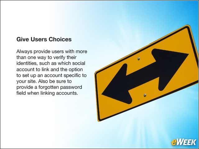
Always provide users with more than one way to verify their identities, such as which social account to link and the option to set up an account specific to your site. Also be sure to provide a forgotten password field when linking accounts.
Make Sure to Test, Test and Test Again

This was the primary problem with Healthcare.gov—not nearly enough testing, especially for the number of people who needed to use it. Even if your registration forms are clear, concise and look great, there’s still room for improvement. Through A/B testing, where different versions of the same form are targeted to separate users, you can narrow down what button placements, layouts, form fields and designs yield the highest conversions (registrations).
Avoid Lengthy Forms
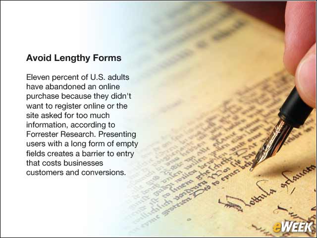
Eleven percent of U.S. adults have abandoned an online purchase because they didn’t want to register online or the site asked for too much information, according to Forrester Research. Presenting users with a long form of empty fields creates a barrier to entry that costs businesses customers and conversions.
Guide by Design
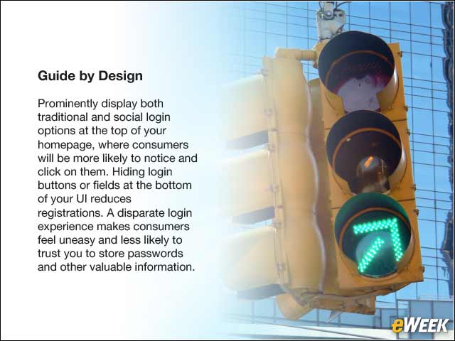
Prominently display both traditional and social login options at the top of your homepage, where consumers will be more likely to notice and click on them. Hiding login buttons or fields at the bottom of your UI reduces registrations. A disparate login experience makes consumers feel uneasy and less likely to trust you to store passwords and other valuable information.
Consistency Is Key
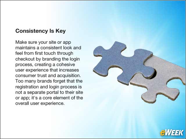
Make sure your site or app maintains a consistent look and feel from first touch through checkout by branding the login process, creating a cohesive user experience that increases consumer trust and acquisition. Too many brands forget that the registration and login process is not a separate portal to their site or app; it’s a core element of the overall user experience.
Think Through Logic Loops
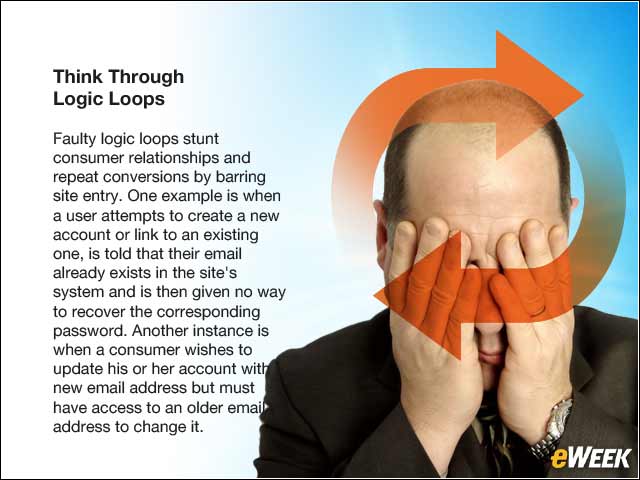
Faulty logic loops stunt consumer relationships and repeat conversions by barring site entry. One example is when a user attempts to create a new account or link to an existing one, is told that their email already exists in the site’s system and is then given no way to recover the corresponding password. Another instance is when a consumer wishes to update his or her account with a new email address but must have access to an older email address to change it.
Communication Leads to Fewer Errors

Page submission errors occur when users cannot properly submit registration forms, either due to a technical fault on the back end or because the form variables don’t correspond with the database. For example, a registration dialog with a built-in logic requiring new users to create passwords that are at least six characters in length should clearly communicate this requirement to users upon registration, instead of simply displaying a generic error message when users attempt to submit their registration forms.
Be Prepared to Scale

Ensure that your database can scale according to your data load. For example, businesses collecting social profile and traditional registration data will need to store and manage unlimited data fields in a secure database equipped to consolidate varied data points and handle sudden spikes in registration volume.