







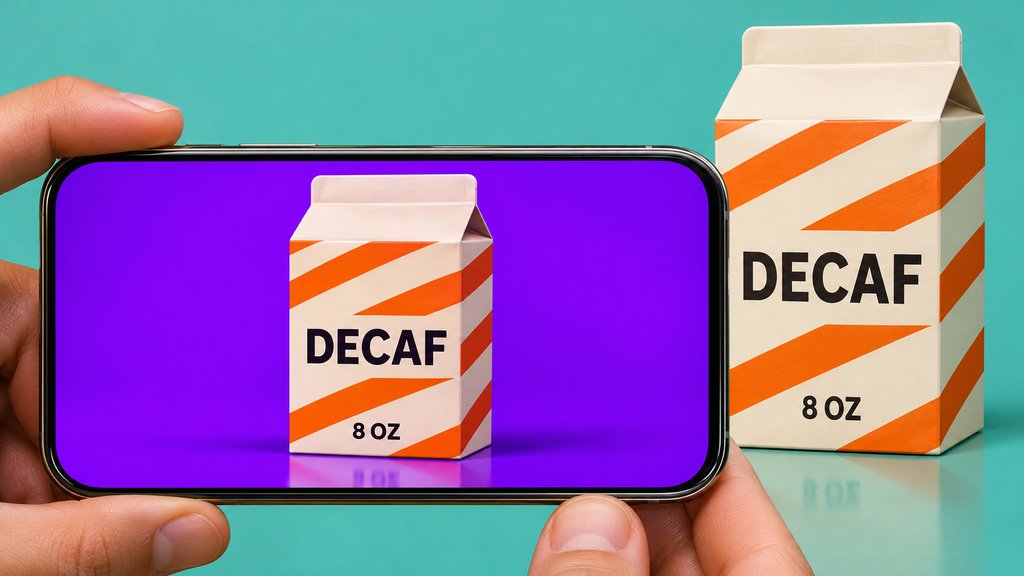
A nicer backdrop isn’t much of a win if your 12-ounce bottle comes back as a 16-ounce bottle.
AI image editors can put a product on a new backdrop without another shoot. For anyone selling a real product, the catch is that the bottle, box, or bag in the edited photo must still match what the customer receives. A wrong digit or a different finish can be hard to spot at thumbnail size.
We tried a background-only edit on three AI-generated mock products and checked what stayed the same. The aim was to see whether the edit preserved the package, not which image looked best.
How we ran the demo
We used one OpenAI image tool to create a teal bottle, an ivory carton, and a glossy blue pouch. Starting from each original image, we asked the tool to replace the backdrop and floor with warm gray and keep the package and every printed character unchanged. We kept the first result for each product.
This was one edit per mock product, not a head-to-head or a test on photographs of real merchandise. We compared the visible package and wording side by side. OpenAI’s editing guide notes that edits can extend beyond an area you select. The settings and behavior of other image editors can differ.
What eWEEK found: Label text held, but surfaces shifted
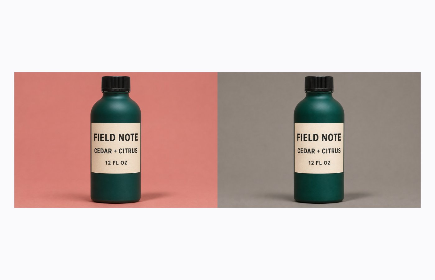
All three first edits replaced the original background with gray and preserved the visible label wording. The changes we noticed were subtler: the paper on the bottle looked different in spots, and so did the reflections on the pouch. Reading the label alone wouldn’t have caught either change.
On the bottle, “FIELD NOTE,” “CEDAR + CITRUS,” and “12 FL OZ” all stayed readable in the same order. The curved label’s outline and placement looked consistent. Zoom in on the cream paper, though, and the grain looks a little more pronounced in the edit. The quantity stayed accurate, but this wasn’t a pixel-for-pixel preservation of the label.
Carton and pouch results
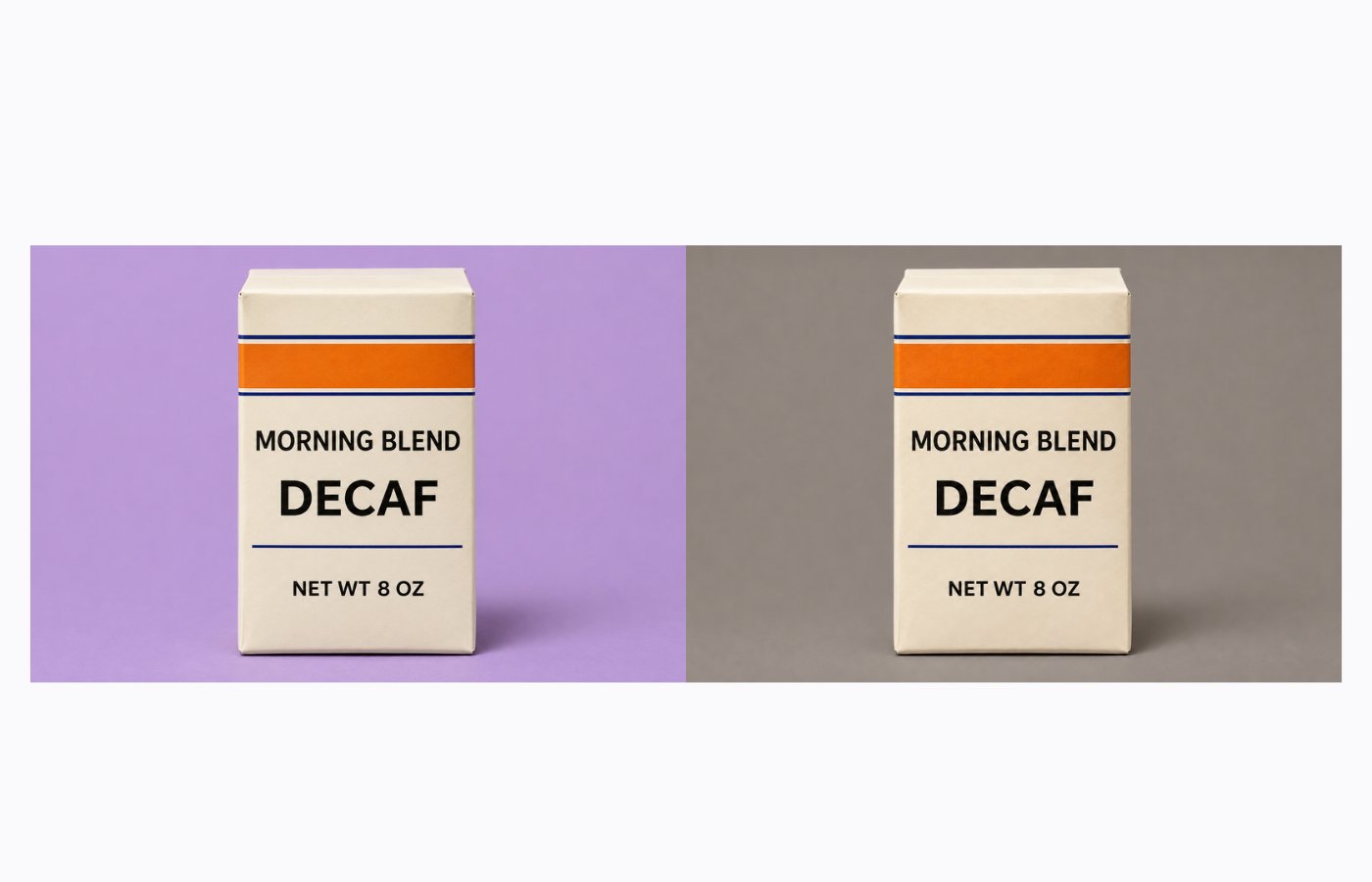
The flat-front carton gave us two separate things to check: the product variant and the amount in the box.
The edit kept both “DECAF” and the smaller “NET WT 8 OZ” line. The orange band and thin navy rules also stayed in their original positions by eye. This was the clearest example of a background change leaving the details a shopper uses to identify the product intact. We didn’t test a nutrition panel, barcode, or other fine print.
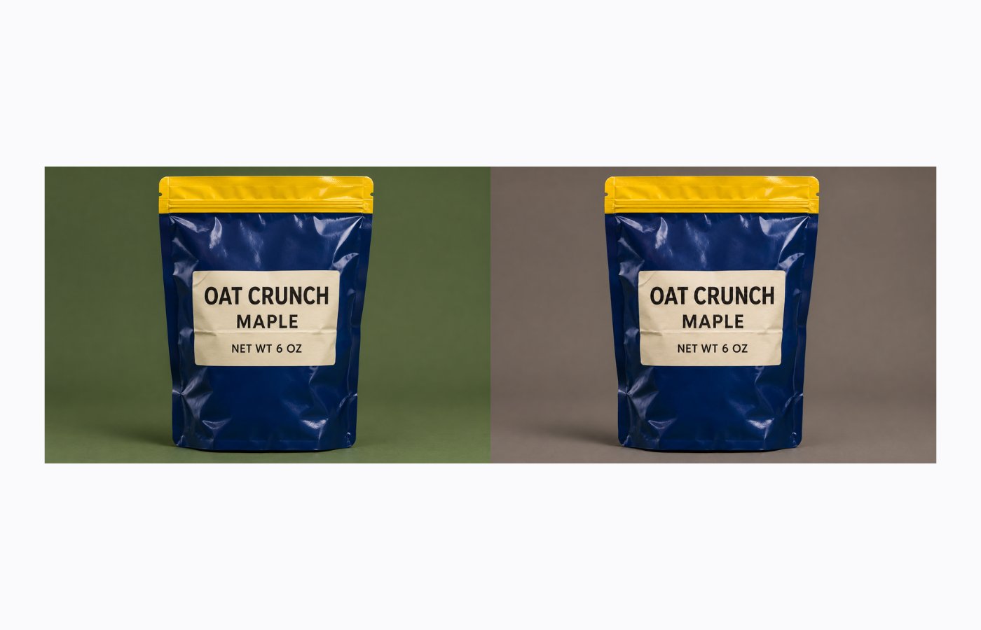
The pouch kept all three lines of label text, including “MAPLE” and “NET WT 6 OZ,” as well as the yellow seal.
But the bright highlights on the blue plastic shifted, particularly near the upper right. That could be acceptable for a lifestyle image, where the lighting is part of the scene. For a catalog image meant to show a specific sheen or finish, the original gives you a better reference than the edit.
The distinction is between preserving what the package says and preserving what the product looks like. We saw no text errors in these three first attempts, but we checked by eye and didn’t measure color or run repeat trials. The examples support a two-part review: check the wording against the original, then examine the material, edges, and finish separately.
In our earlier ChatGPT versus Nano Banana test, the product-photo task asked the tools to make headphones look convincing. Here, we had a reference image that could tell us whether an edit changed the product.
How to review an AI edit before it goes live
A small demo can show you what to inspect, but it can’t predict how an editor will handle the rest of your catalog.
Test the harder objects in your own lineup before rolling out a tool across a batch: reflective pouches, curved labels, or packaging with fine print. Google’s Product Studio is one tool designed to change backgrounds in merchant photos.
- Read the label at full size. Check the product name, quantity, variant, and any claims or warnings against the original or approved label artwork. If the source is too blurry to check, take a sharper photo. An editor can make unreadable print look clear without making it correct.
- Keep the product separate if it keeps changing. Use a cutout from the original photo on a separate background. Check that the edge isn’t clipped and that any new shadows don’t obscure the packaging. If exact colors or finishes matter, compare the exported image with the source before approving it.
- Open the same file customers will see. Inspect the final export at the size it will appear on the page, including the mobile thumbnail. Check for changes to the product, not simply whether the layout looks polished.
The approval question is simple: Would someone who saw this image recognize exactly what arrives in the box? If not, keep the original or reshoot. The point of replacing the background is to save time, not to make customers guess what they’re buying.
For more on how these tools handle different kinds of edits, see eWEEK’s coverage of ChatGPT Images 2.0.
Related reading: Want to learn more? Compare the major tools in eWEEK’s AI image generator cheat sheet.